Choosing the Right Colors for Your Brand
Color is a powerful tool in branding. It shapes perceptions, evokes emotions, and makes your brand stand out in a crowded marketplace. The right color palette not only defines your brand’s visual identity but also communicates its personality, values, and mission. This guide will help you choose the perfect colors for your brand, ensuring a memorable and visually appealing identity.
Why Color Matters in Branding
First Impressions
People form opinions about your brand in just a few seconds. Colors are one of the first things they notice, setting the tone for your brand message.Emotional Impact
Colors evoke specific emotions and associations. For example, blue often conveys trust and reliability, while red can symbolize energy and passion.Recognition and Recall
Consistent use of brand colors enhances recognition. Think of brands like Coca-Cola (red) or Facebook (blue)—their colors are integral to their identities.
Steps to Choosing the Right Colors for Your Brand
Key ways an online presence helps you expand:
Understand Your Brand Personality
Start by defining your brand’s essence. Ask yourself:
- What values does my brand stand for?
- How do I want my audience to feel when they interact with my brand?
- Is my brand playful, professional, luxurious, or innovative?
For instance:
- What values does my brand stand for?
- How do I want my audience to feel when they interact with my brand?
- Is my brand playful, professional, luxurious, or innovative?
Learn the Psychology of Colors
Each color has a psychological impact. Here’s a quick overview:
- Red: Excitement, passion, energy
- Blue: Trust, stability, calm
- Yellow: Optimism, warmth, happiness
- Green: Growth, health, harmony
- Purple: Creativity, luxury, wisdom
- Black: Sophistication, power, elegance
- White: Simplicity, purity, cleanliness
Match these attributes to your brand’s personality to create an emotional connection with your audience.
Research Your Target Audience
Different audiences respond to colors differently. Cultural perceptions and preferences can vary significantly. For example, in Western cultures, white symbolizes purity, but in some Eastern cultures, it’s associated with mourning. Ensure your palette resonates with your target demographic.Analyze Competitors
Study the color choices of competitors in your industry. While you don’t want to copy them, understanding the norms can help you differentiate your brand. If most competitors use blue, consider a contrasting color to stand out. Create a Color Palette
A brand’s color palette usually includes:
- Primary Colors: The main colors that represent your brand.
- Secondary Colors: Additional colors to complement the primary palette.
- Accent Colors: Used sparingly for emphasis and highlights.
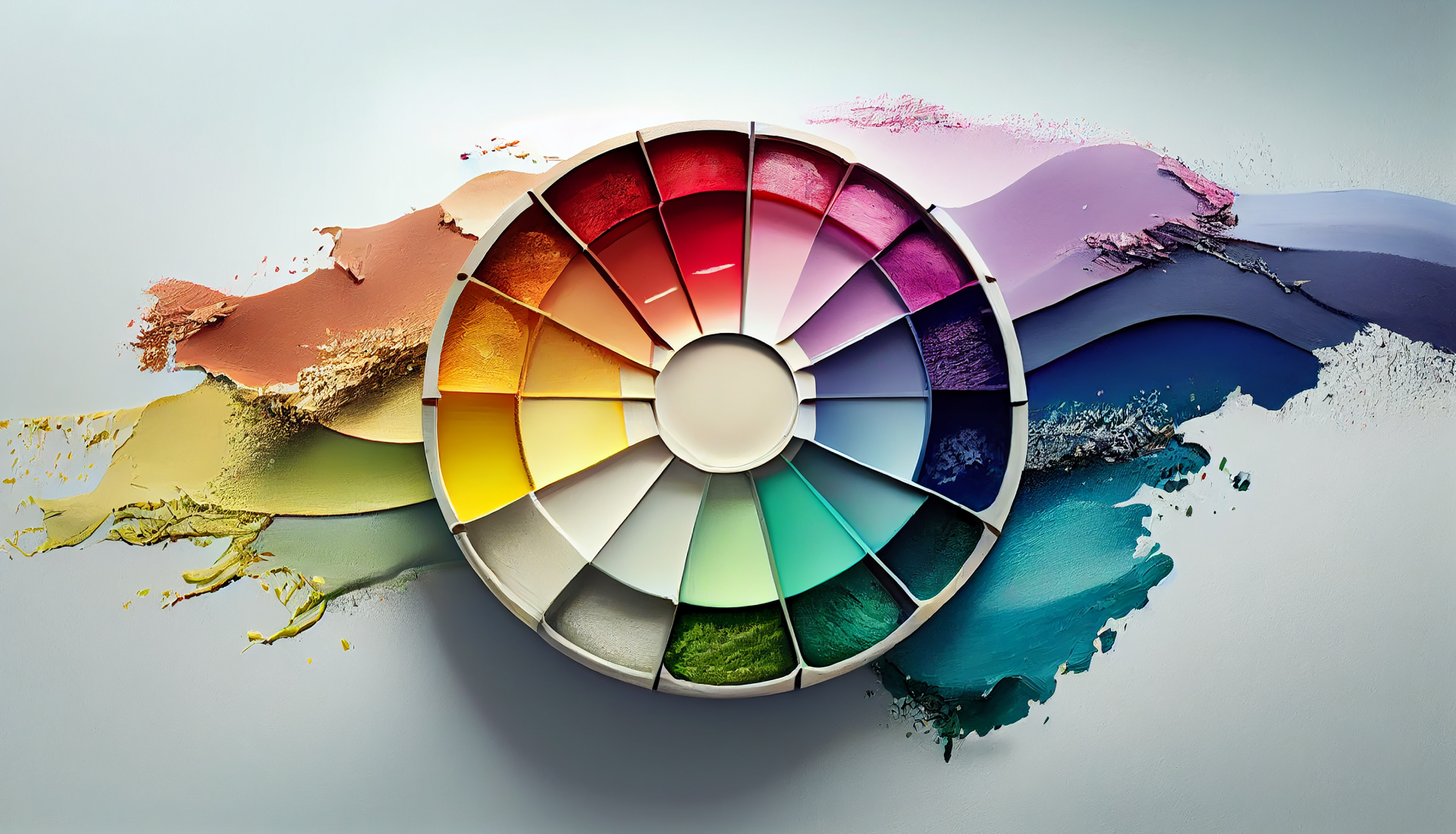
Use tools like Adobe Color, Coolors, or Canva’s color wheel to experiment and find harmonious combinations.
Test and Refine
Before finalizing your palette, test it in different applications—logos, websites, marketing materials, and product packaging. Ensure it looks great in both digital and print formats. Feedback from your team or focus groups can provide valuable insights.
Consistency Is Key
Once you’ve chosen your colors, use them consistently across all brand touchpoints, including your website, social media, and marketing materials. This builds recognition and trust, reinforcing your brand identity.
Final Thoughts
Choosing the right colors for your brand isn’t just about aesthetics—it’s about telling a story and connecting emotionally with your audience. By understanding your brand’s personality, audience preferences, and the psychology of colors, you can craft a palette that resonates and leaves a lasting impression.
Ready to start your color journey? Remember, your brand’s colors are more than just hues—they’re your brand’s voice, speaking volumes before a single word is read.
