In the world of branding, every visual element speaks volumes about your business. Among these elements, typography stands out as a subtle yet powerful tool for conveying your brand’s personality, values, and voice. Typography is more than the fonts you choose—it's a cornerstone of your brand identity that ensures your message resonates visually and emotionally with your audience.
Let’s delve into the art of typography in branding, exploring how to select and pair typefaces that perfectly align with your brand identity.
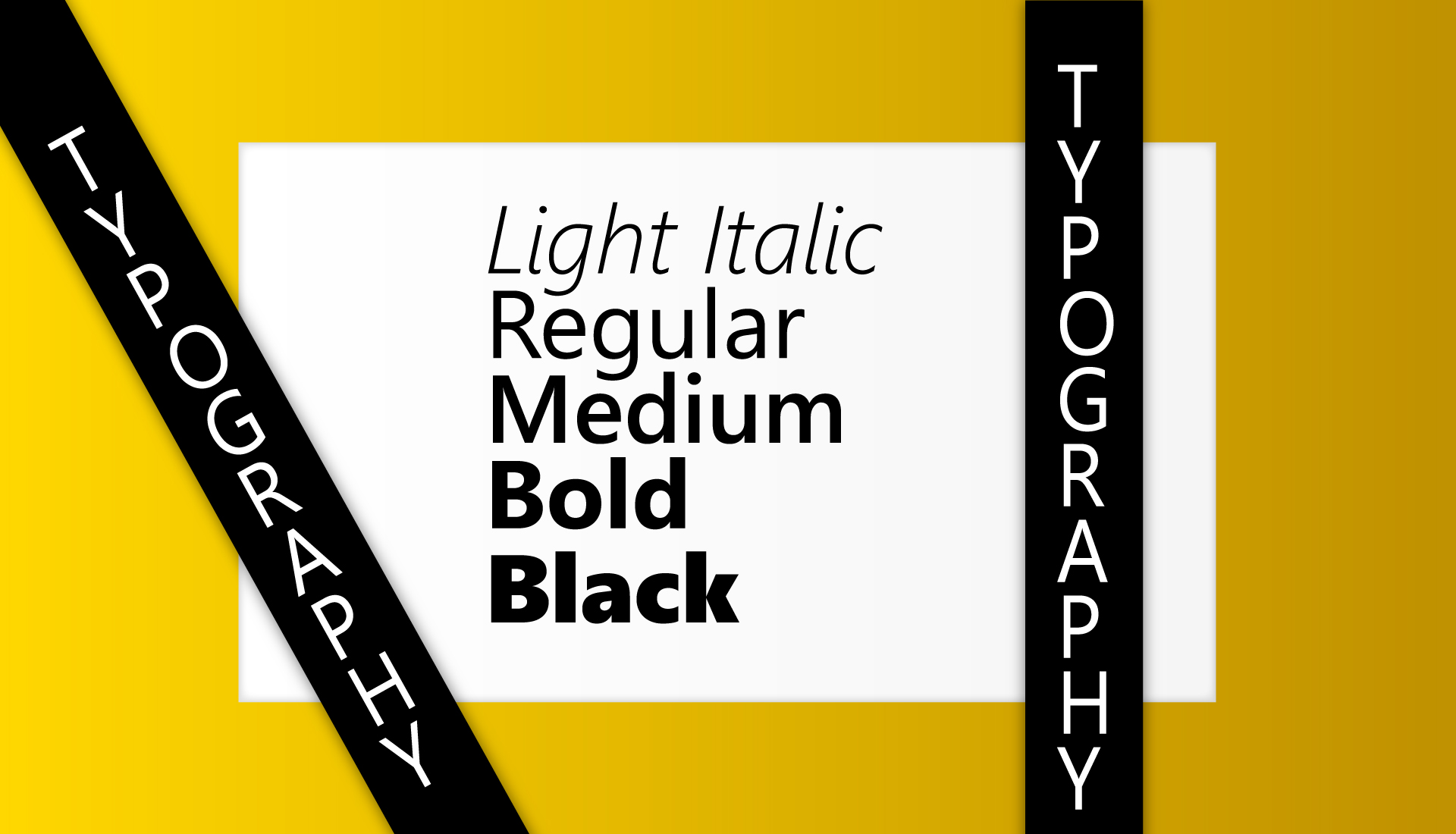
Typography goes beyond aesthetics. It sets the tone of your communication and evokes emotions. The right typefaces can make your brand appear professional, approachable, luxurious, or playful. For example:
By aligning your typography with your brand’s values, you create an immediate visual connection with your audience.
For instance, a minimalist tech brand may lean toward clean, geometric sans-serif fonts, while a luxury fashion label might opt for elegant serifs.
For example, pairing a bold serif font for headings with a clean sans-serif font for body text often creates a harmonious look.
By understanding font psychology, you can craft a brand voice that speaks directly to your audience.
Typography is an art form that blends creativity with communication. By carefully selecting and pairing typefaces that resonate with your brand’s personality, you can create a memorable and impactful identity. Remember, your typography isn’t just decoration—it’s a powerful branding tool that speaks louder than words.
Take the time to experiment, test, and refine your typography choices. In doing so, you’ll ensure that every letter and word contributes to the story your brand tells.

Stay ahead of the curve by exploring the latest graphic design trends. From bold color choices to minimalist styles, incorporating these trends will keep your brand looking fresh and modern in 2025.
Read More
In the digital age, a strong online presence is essential. Discover how a professional website and active social media can build trust, expand your reach, and keep you competitive in your industry.
Read More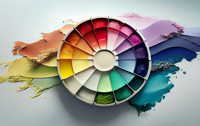
Color plays a vital role in brand perception. In this post, we’ll guide you through selecting the perfect color palette for your brand, helping you create a visually appealing and memorable identity.
Read More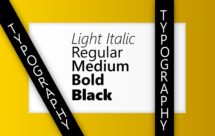
Typography goes beyond fonts; it shapes your brand's voice and personality. This blog covers selecting and pairing typefaces to align with your identity, making your message visually appealing and clear.
Read More